A Flag
University Project
Research
Branding
My project focuses on the enchanting Amalfi Coast in Southern Italy, a beloved summer destination for global tourists. Despite its beauty, the region's rich history often remains hidden beneath the crowds and tourist attractions. Through my research, I've uncovered the fascinating materiality and historical significance of this coastal treasure.


RESEARCH
I divided my research into 3 parts. Each uncovered layers of the place in terms of stories, materials, colours and shapes that helped me build a strong identity from my point of view.
HISTORICAL
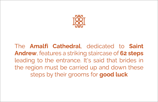
Saracen Towers, an ancient Maritime Republic and an Important trade hub in the 17th century, was under Roman-Byzantine occupation.

PHYSICAL
Traditional craftsmanship, Land and Sea, Cliffside Villages, The Coastline

SOCIAL
Fishing and Agriculture, Tourism, Food Culture, Tradition

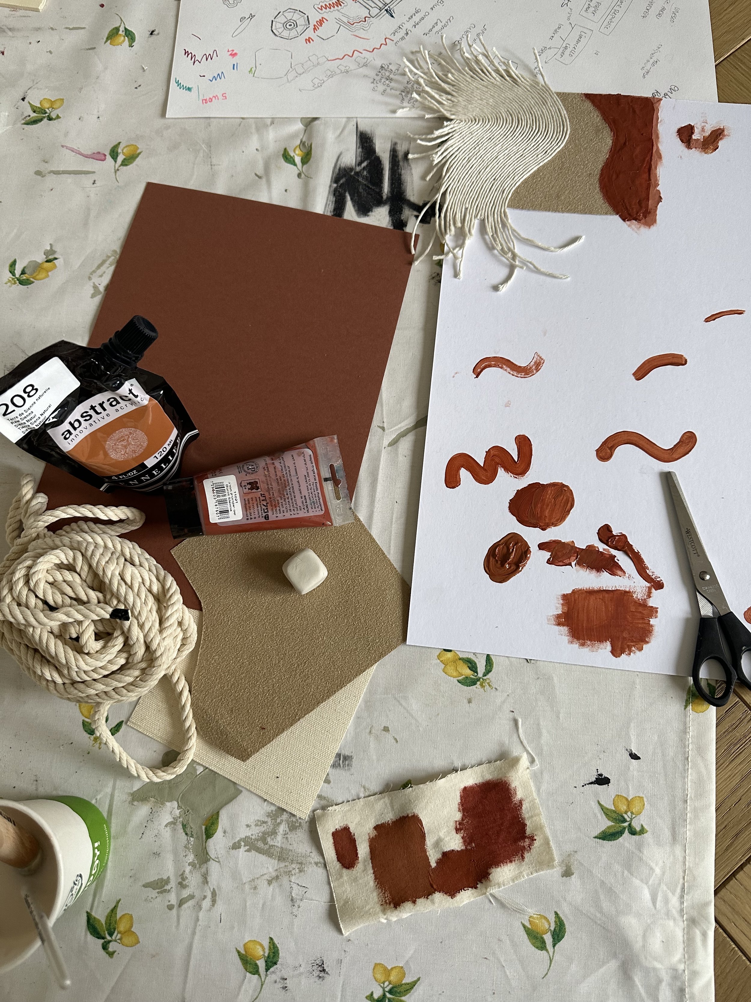
MoodBoard
My design should reflect the lively, contemporary aspect of the place, teeming with tourism, bustling restaurants, and a vibrant atmosphere - Colorful but tight, underscoring the critical historical significance that underpins the Amalfi Coasts.


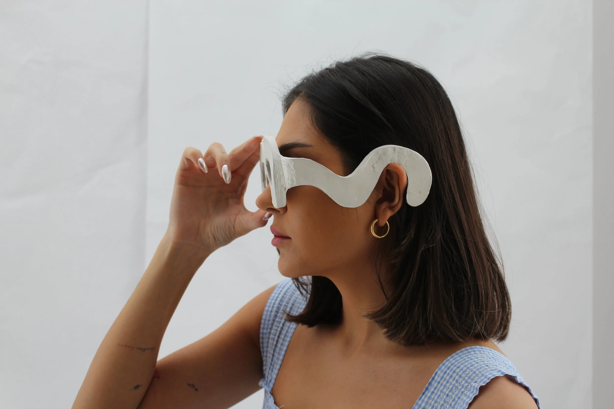
Flag Design
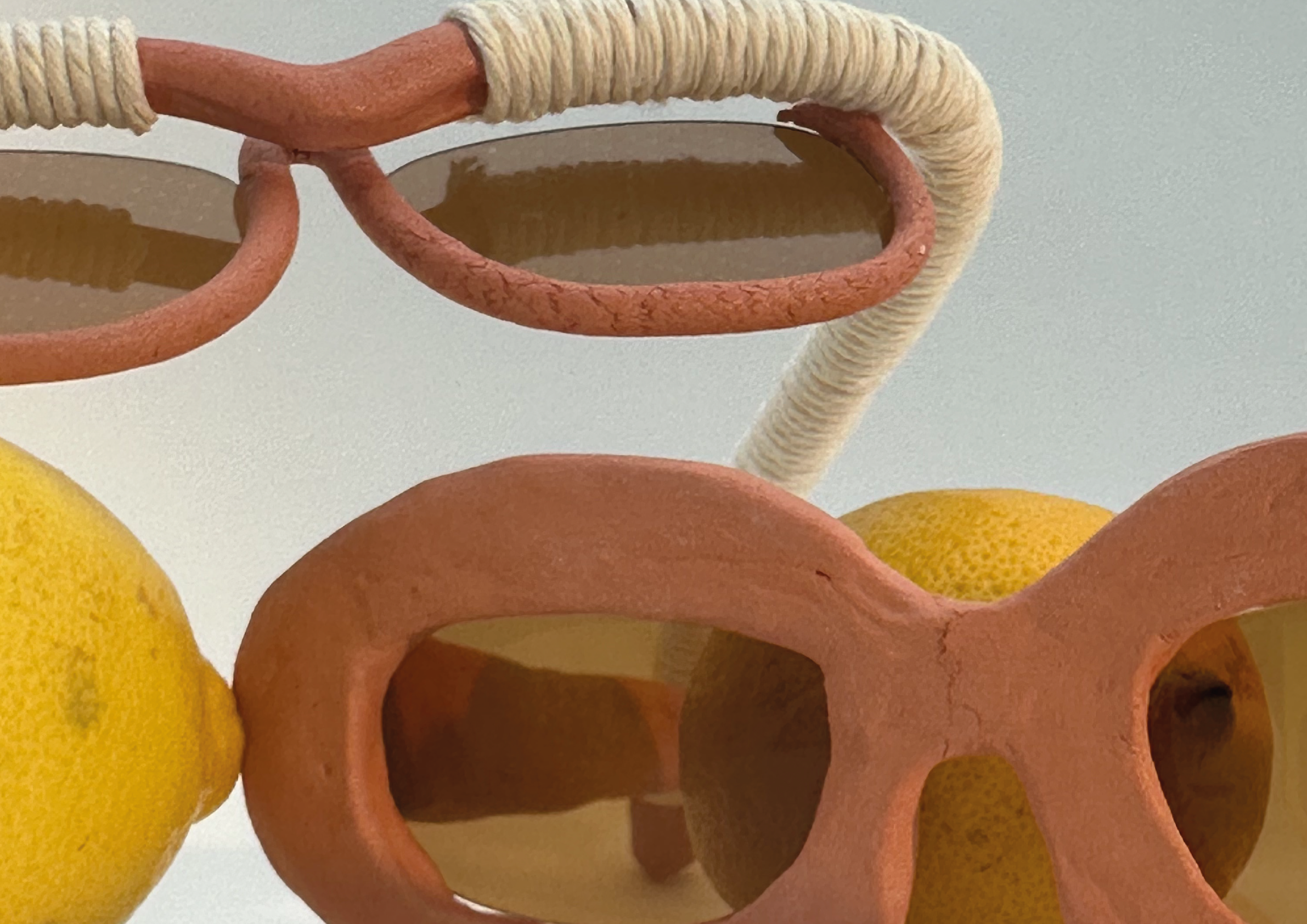
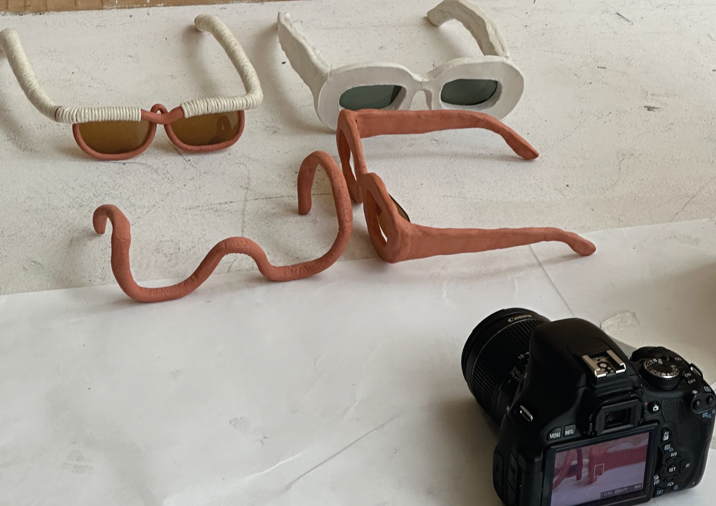
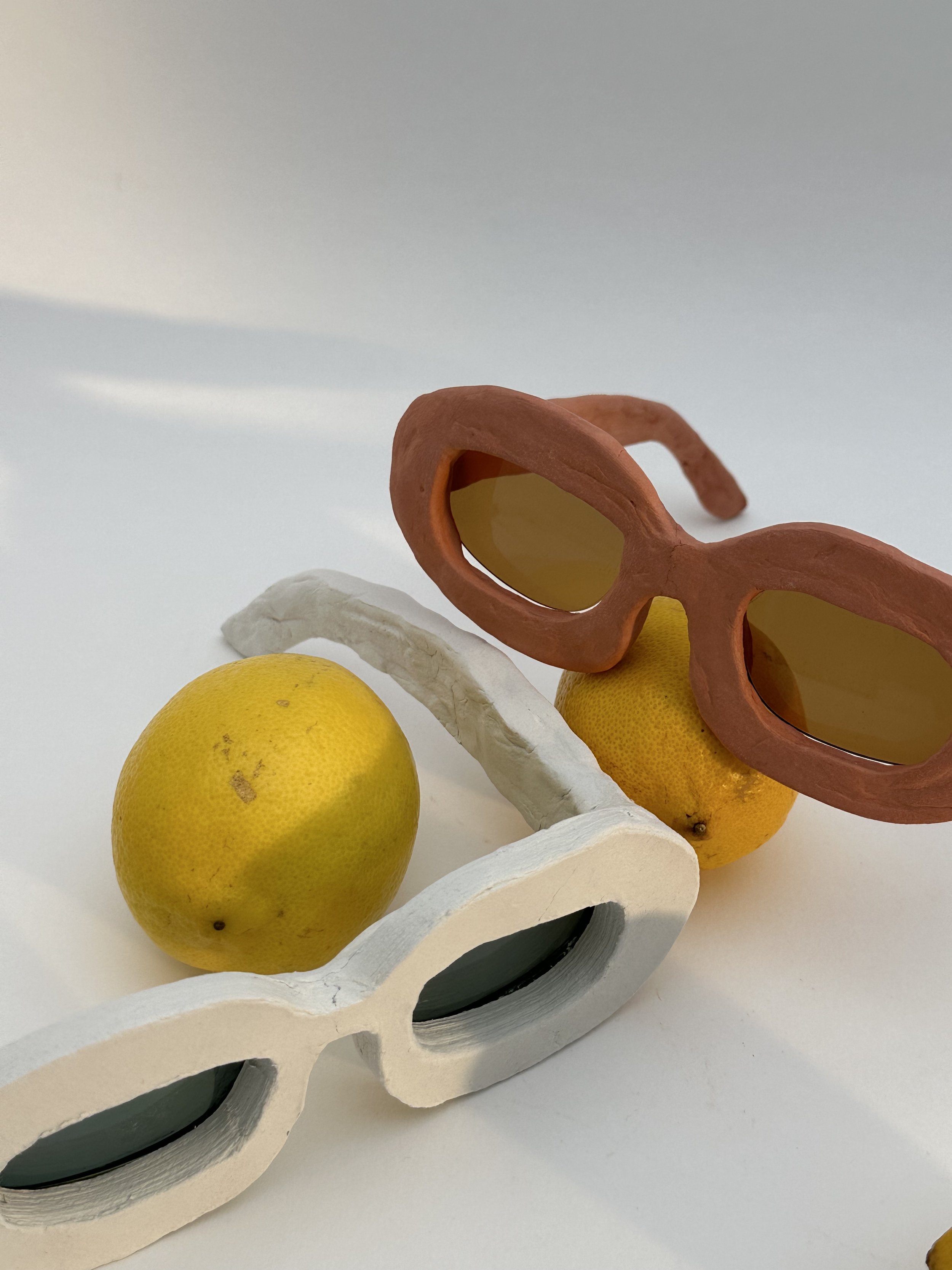
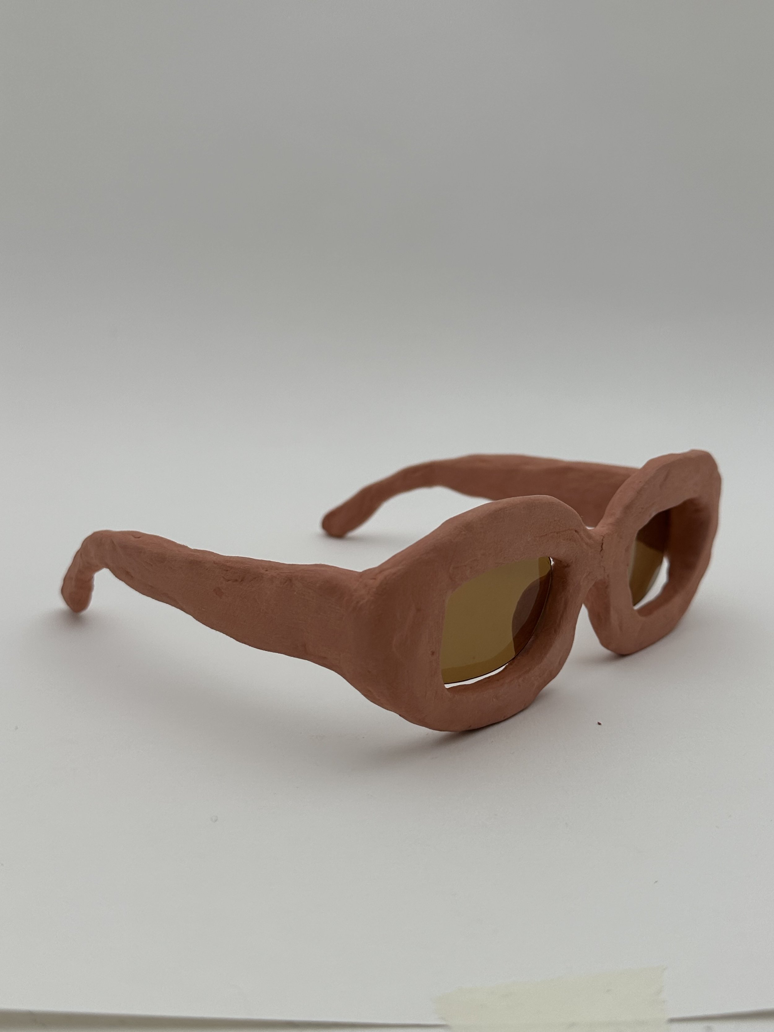
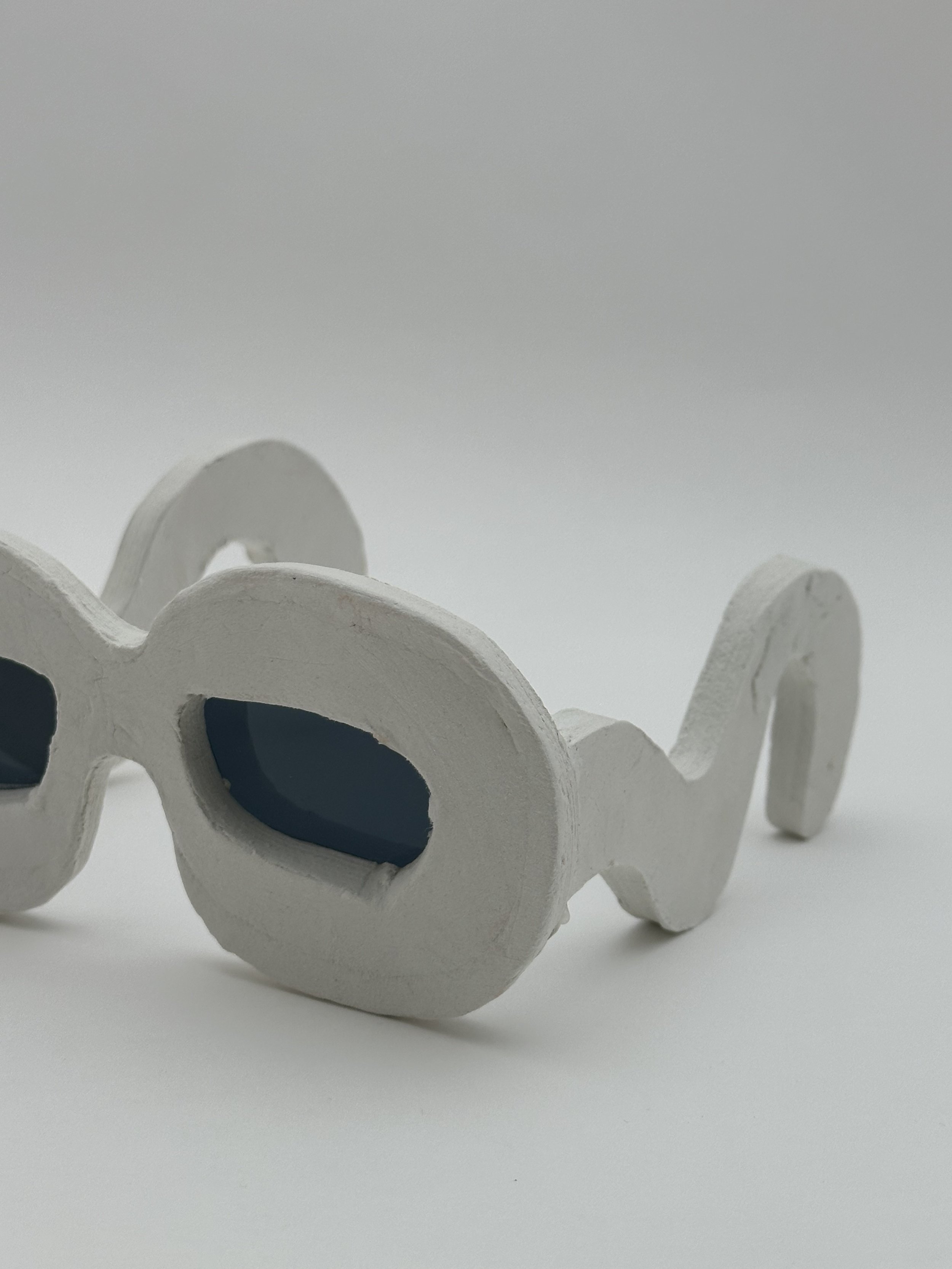
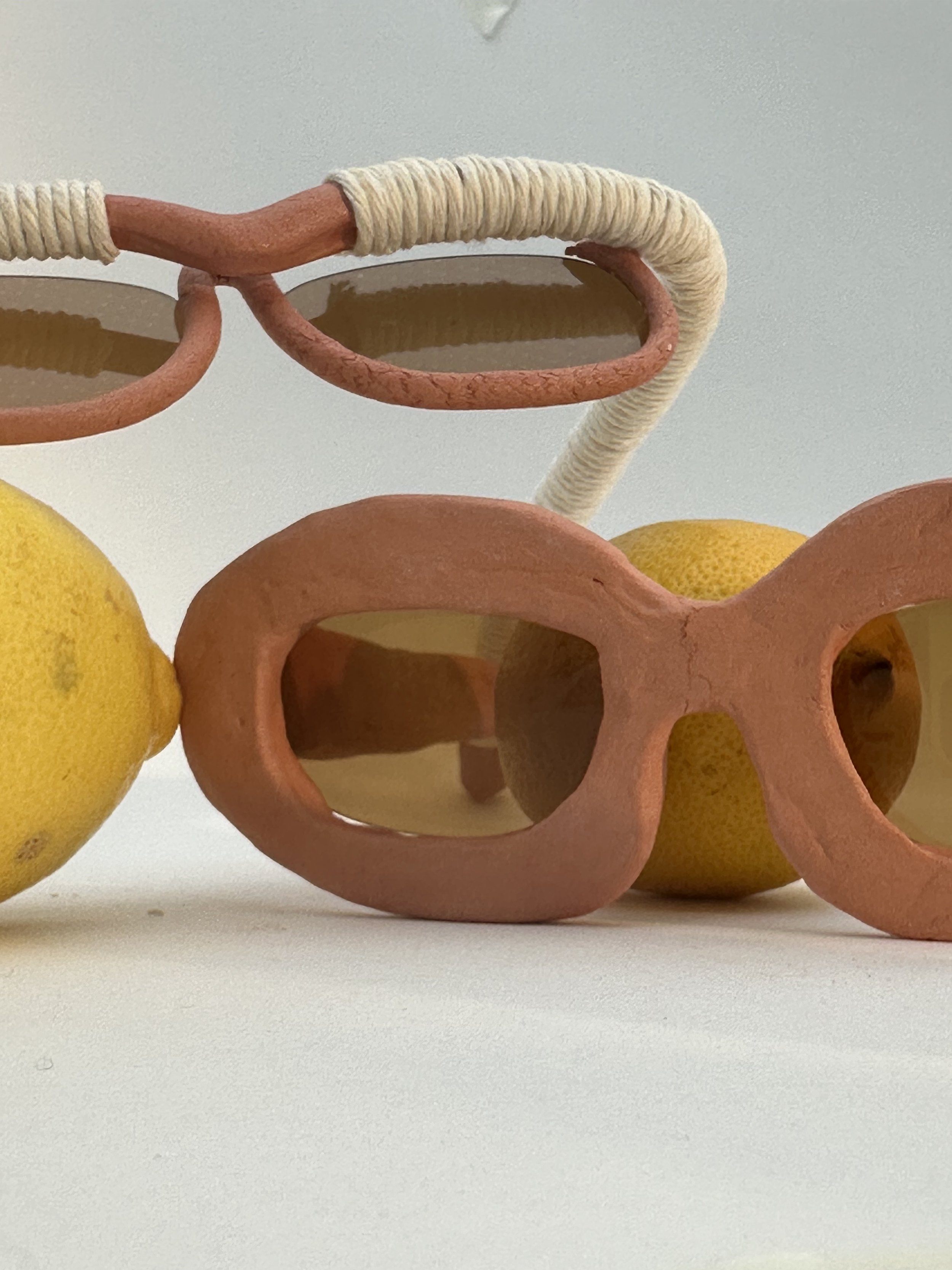
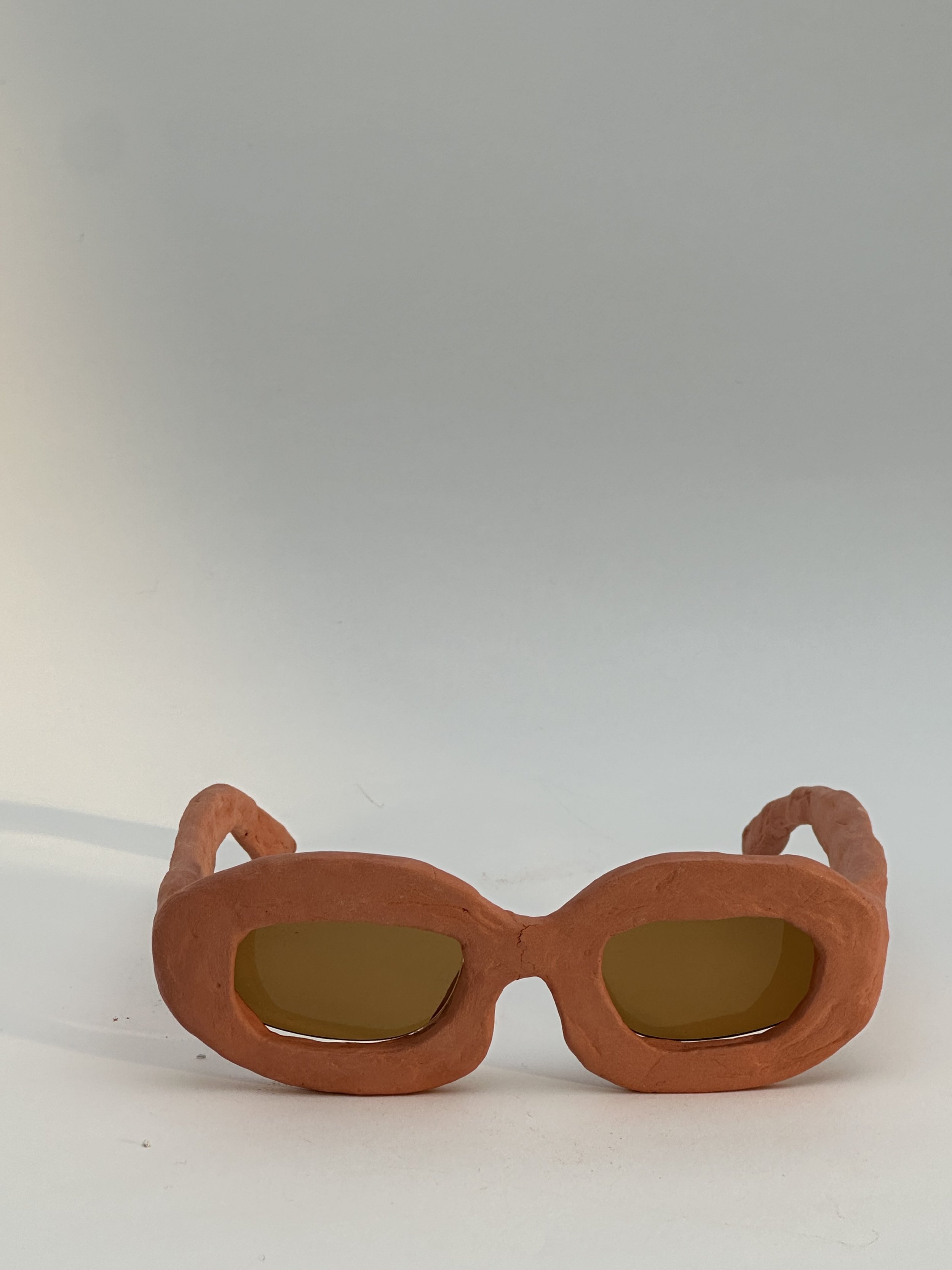
Rope symbolises its history as a bustling trading hub, where ships once docked in marinas, some of which still linger as echoes of the past. Salt represents its vital role in Mediterranean trade and the hidden picturesque hints at the sandy shores. Acrylic signifies Amalfi land, the iconic limestone that defines Amalfi and the handmade ceramics made out of it.
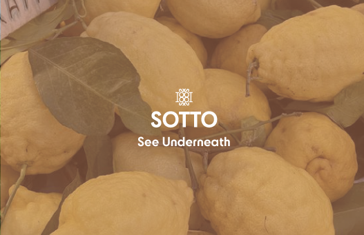
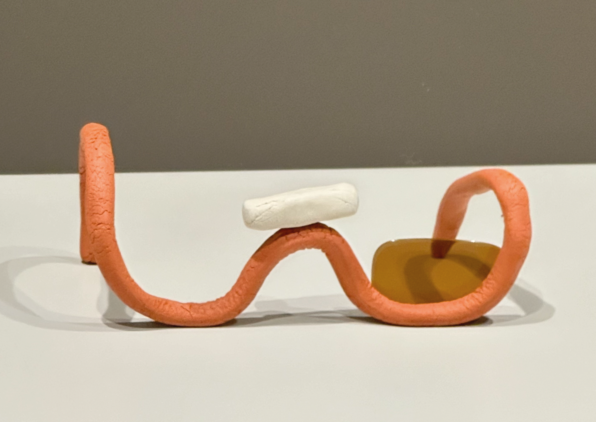
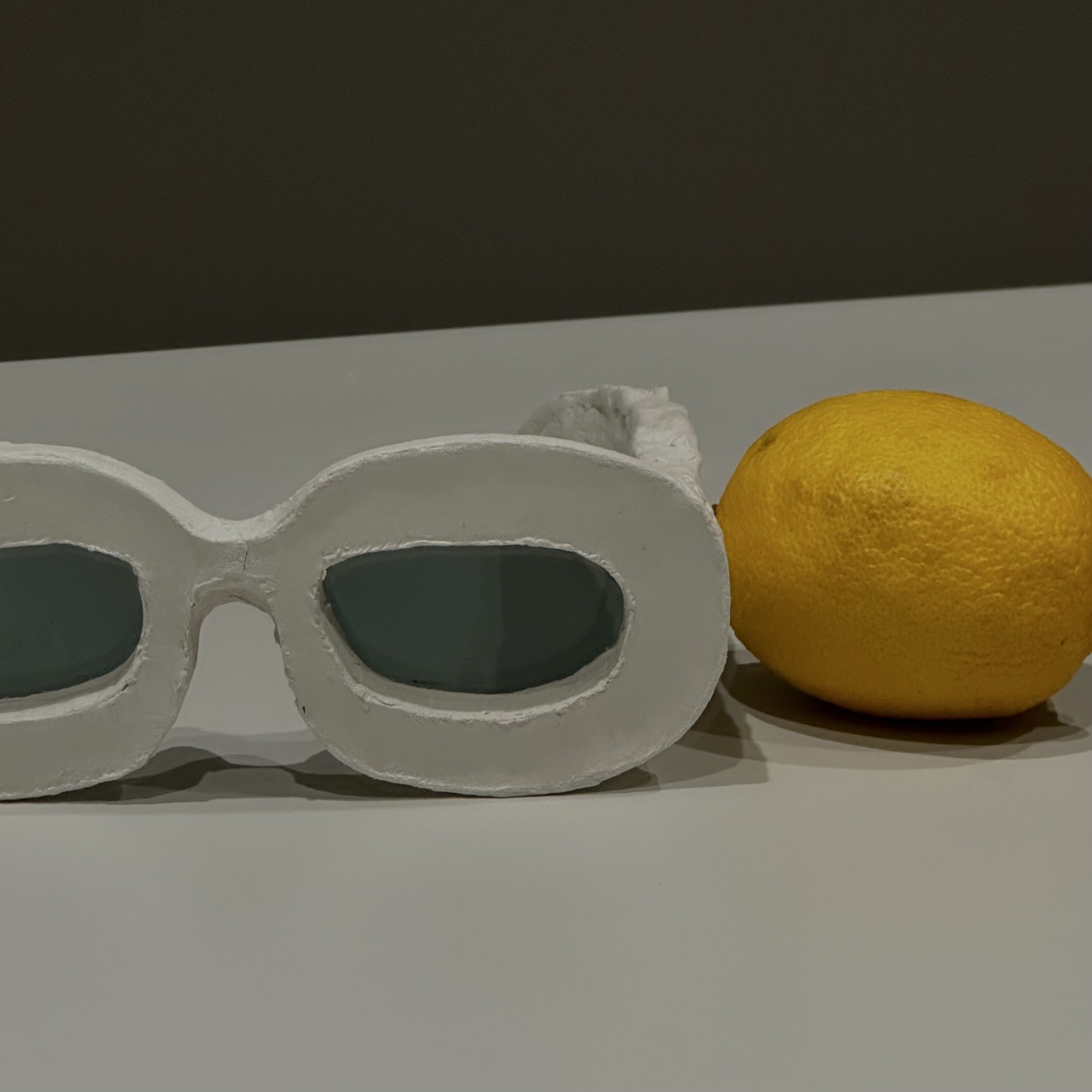
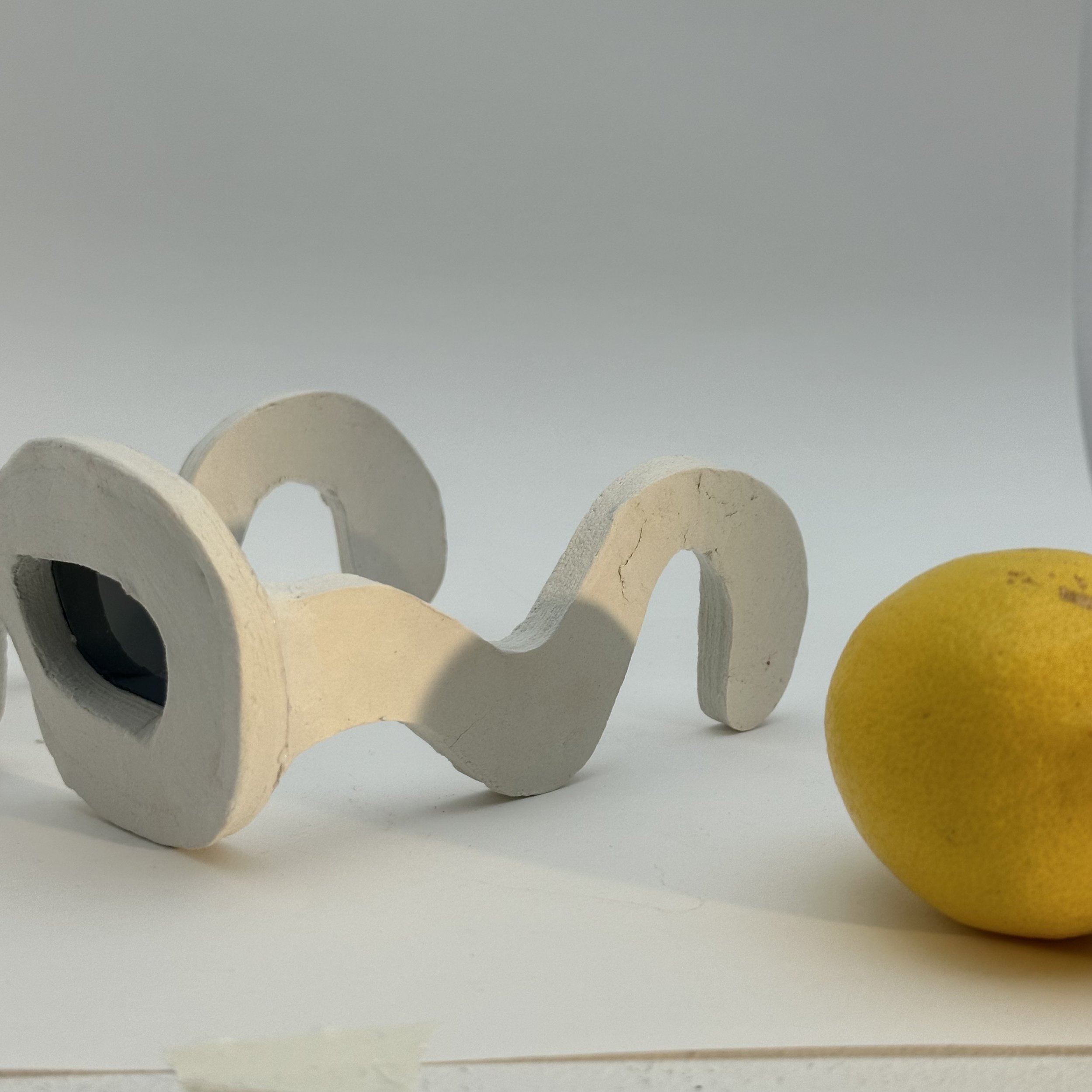
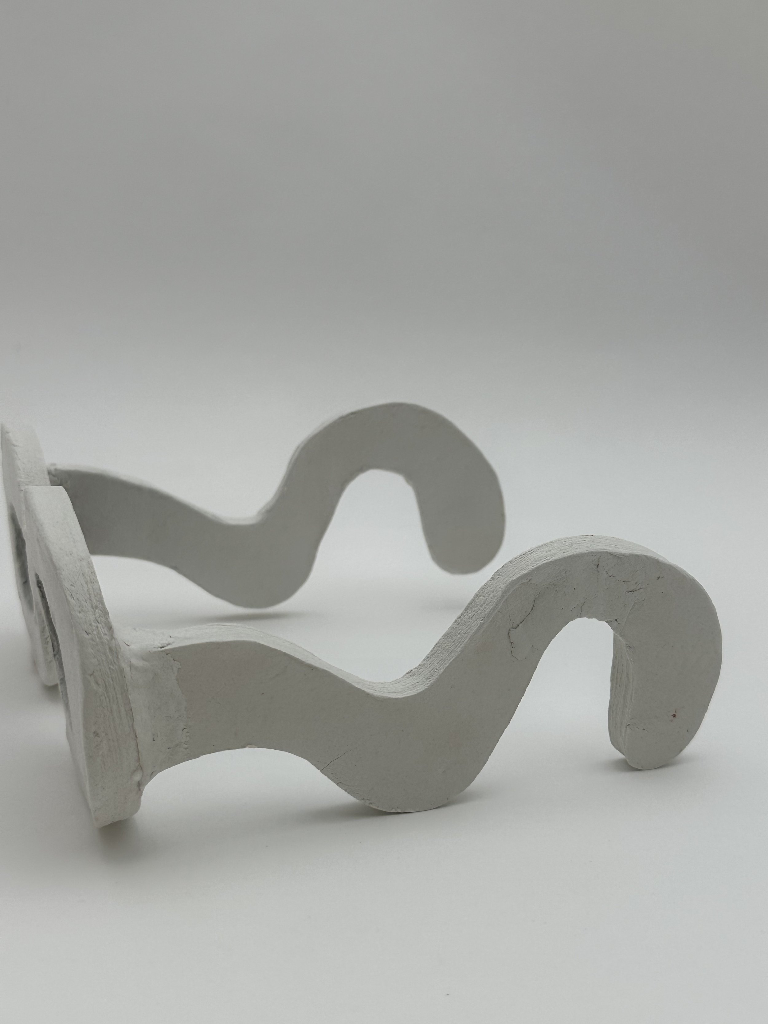
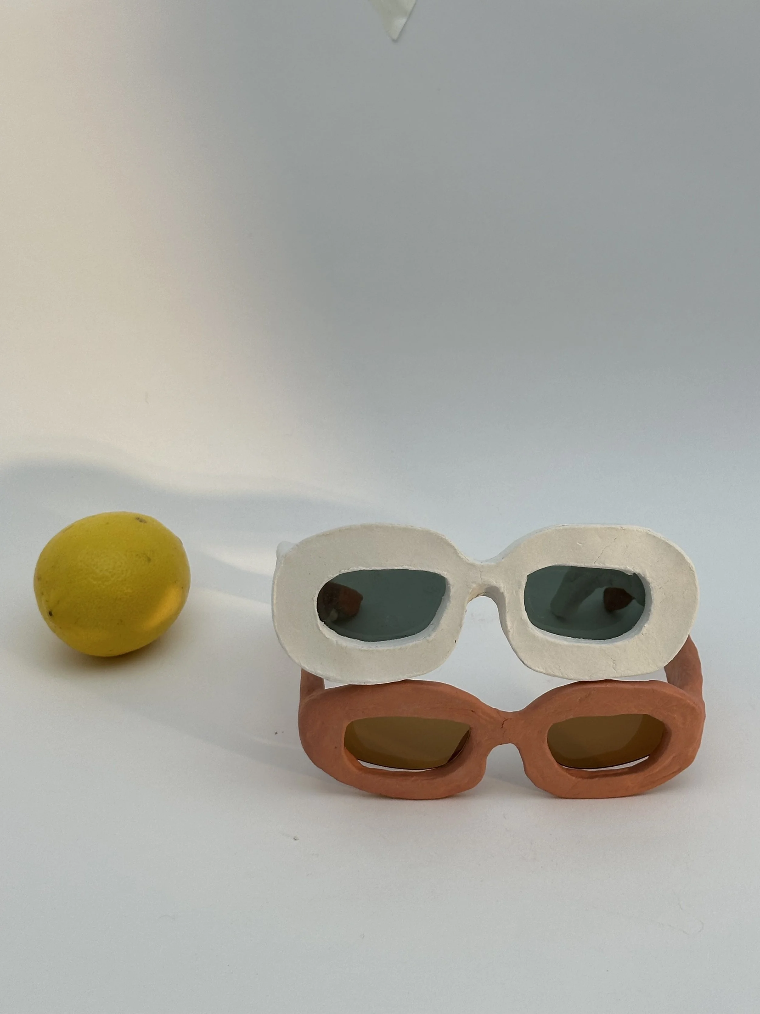
Let me Introduce SOTTO
The brand aims to reveal the stories, characters and history that often remain hidden beneath the crowds and tourist attractions.
The term 'Sotto,' meaning 'Under' or 'Below' in Italian, reflects the concept of discovering what lies beneath the surface. Sunglasses serve as a symbol of a summer destination, blending past and present in a unique way.
BRANDING
I drew the Amalfi flag in a simple way and revisited the colour scheme. I sought a typeface influenced by the proportions of Roman letters. I embarked on creating a logo inspired by Byzantine patterns, adding a layer of historical depth to the brand.

Typeface - I wanted to choose a modern typeface but with a hint of ancient atmosphere


simplification of the flag, added the terracotta colour of the Amalfi famous red clay

Chosen typeface - Cy, modern but follows a square proportion of roman letters

Experimenting with the letters SOTTO to create a logo

The Logo— SOTTO letter combinations create Byzantine pattern with a hint of the Roman column
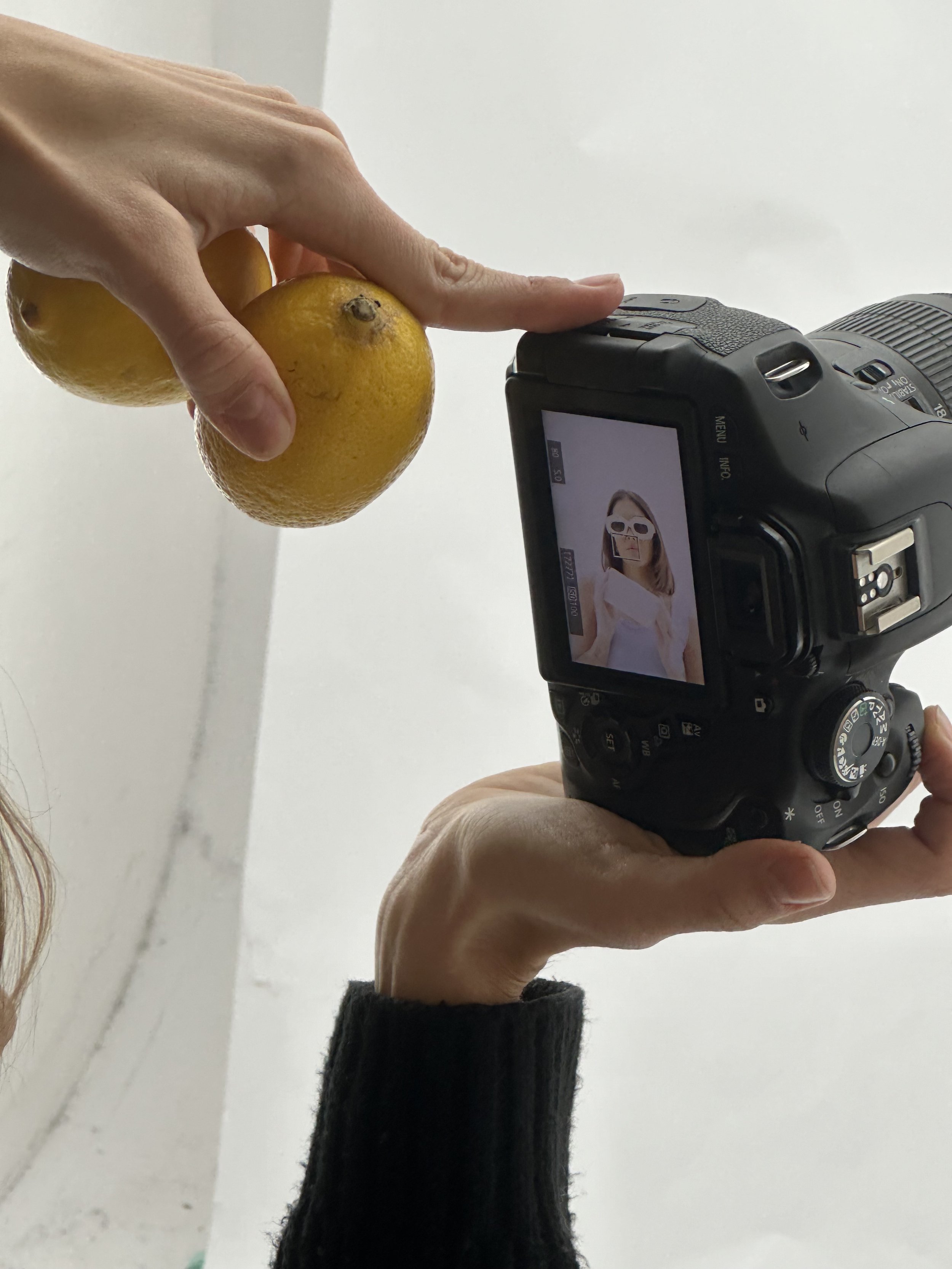
SOTTO IN A CONTEXT
The idea revolves around each pair of sunglasses being accompanied by a box and an informative card, offering intriguing snippets of the region's history. In an age where people readily share their experiences on social media, I envisioned creating enticing photo opportunities within Amalfi that reveal the hidden stories beneath its surface.